
CASE STUDY
Ripple Street
Building a brand system from the ground up for a consumer marketing platform that had outgrown its identity
When I joined Ripple Street in 2021, the brand hadn't been touched in five or six years. It showed.
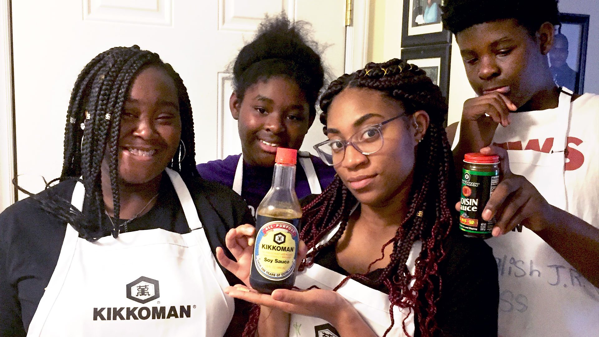
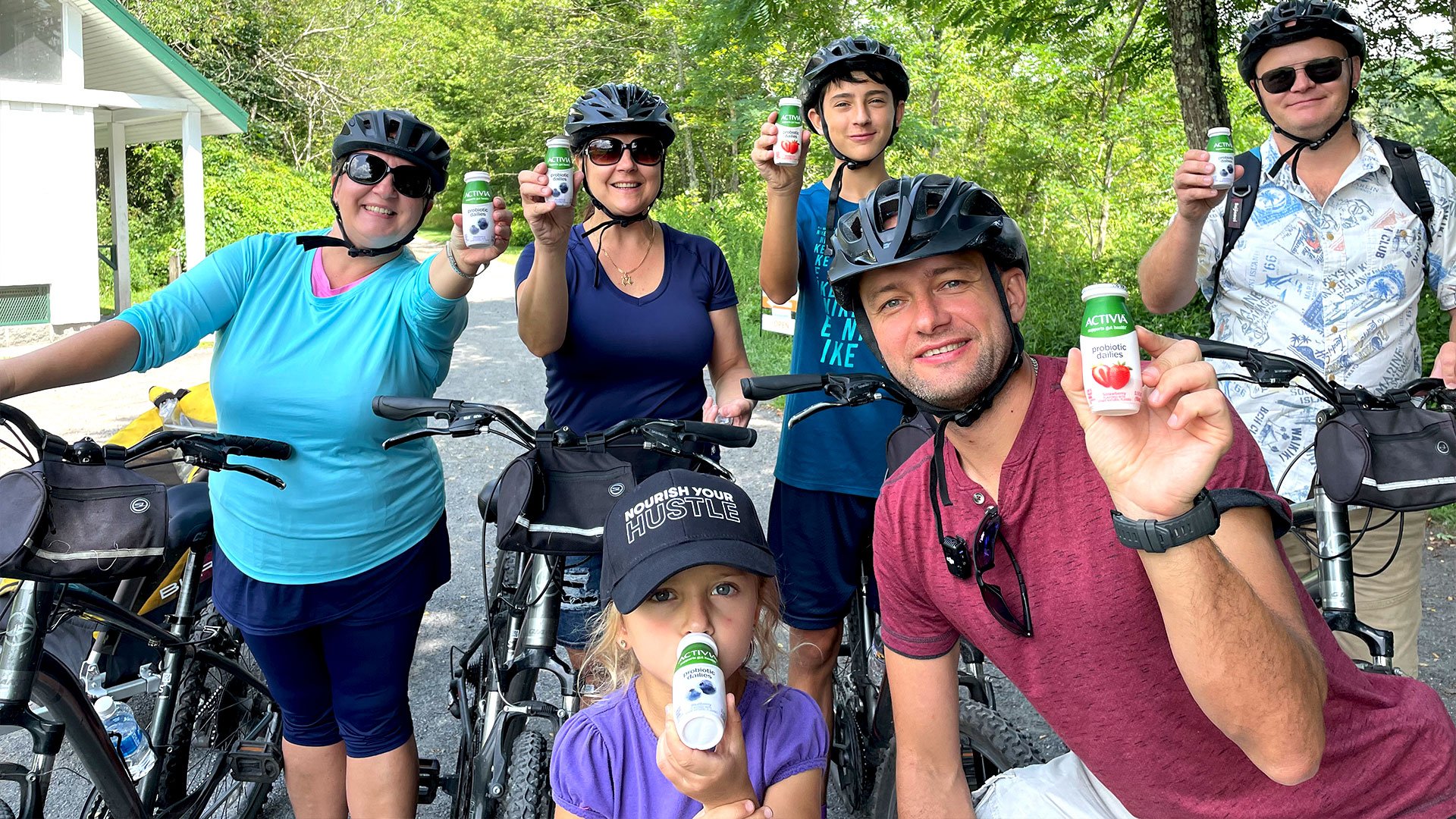
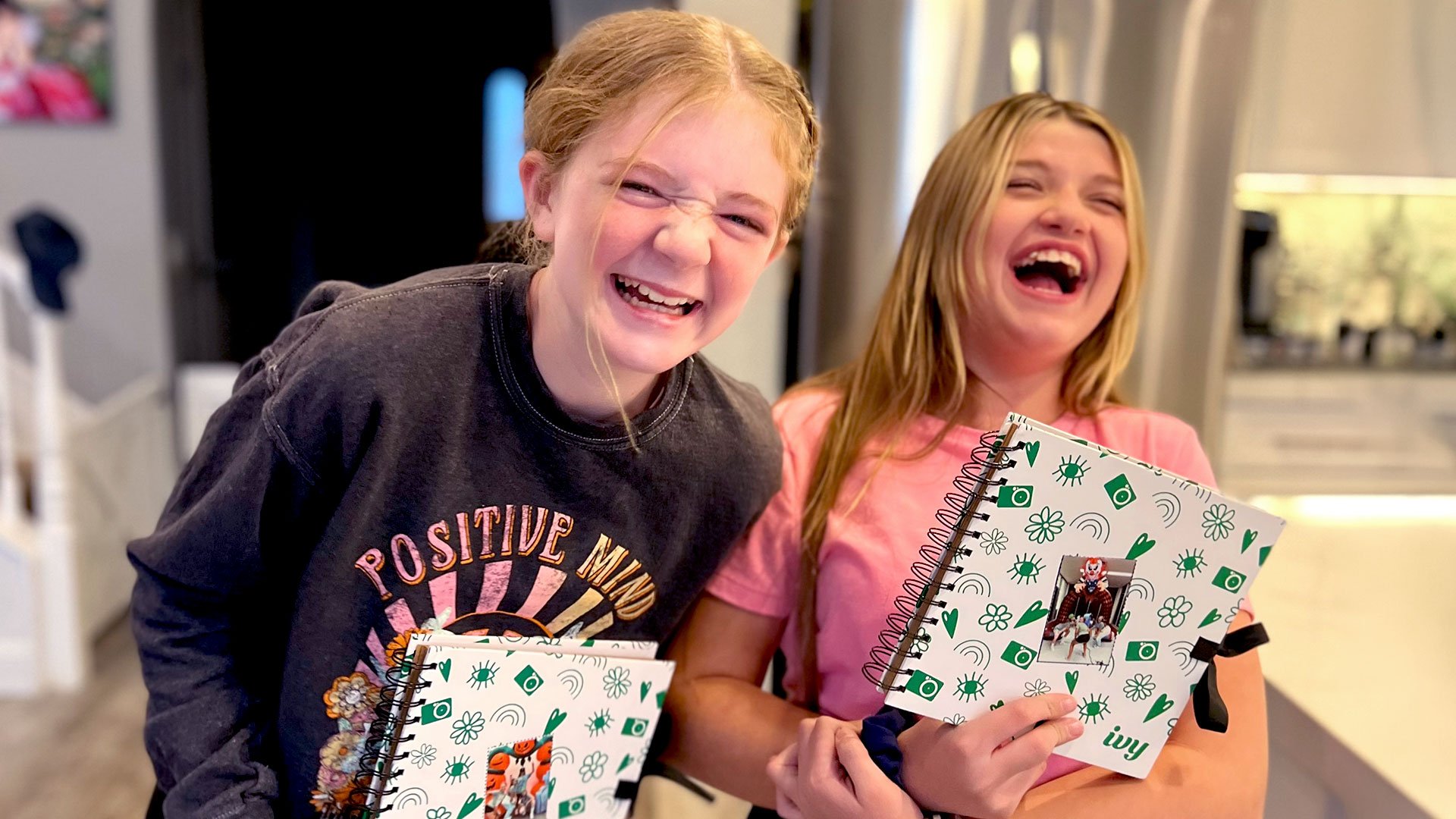
The palette was dull, the logo needed work, and, most confounding for a company built entirely around authentic user-generated content, the brand was plastered with stock photography. Cheesy smiles, staged moments, generic warmth. The opposite of everything Ripple Street actually stood for.
This wasn't a refresh. It was a rebuild.

Above: old Ripple Street branding.
PHOTOGRAPHY
I started with the most obvious problem.
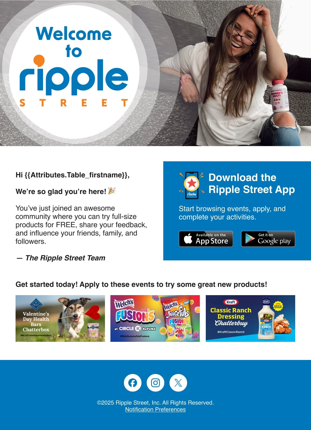
Ripple Street's entire business model is built on authentic user-generated content — real people, real products, real moments. Stock photography was antithetical to everything the brand stood for. My first call: replace every staged, generic image with actual UGC.
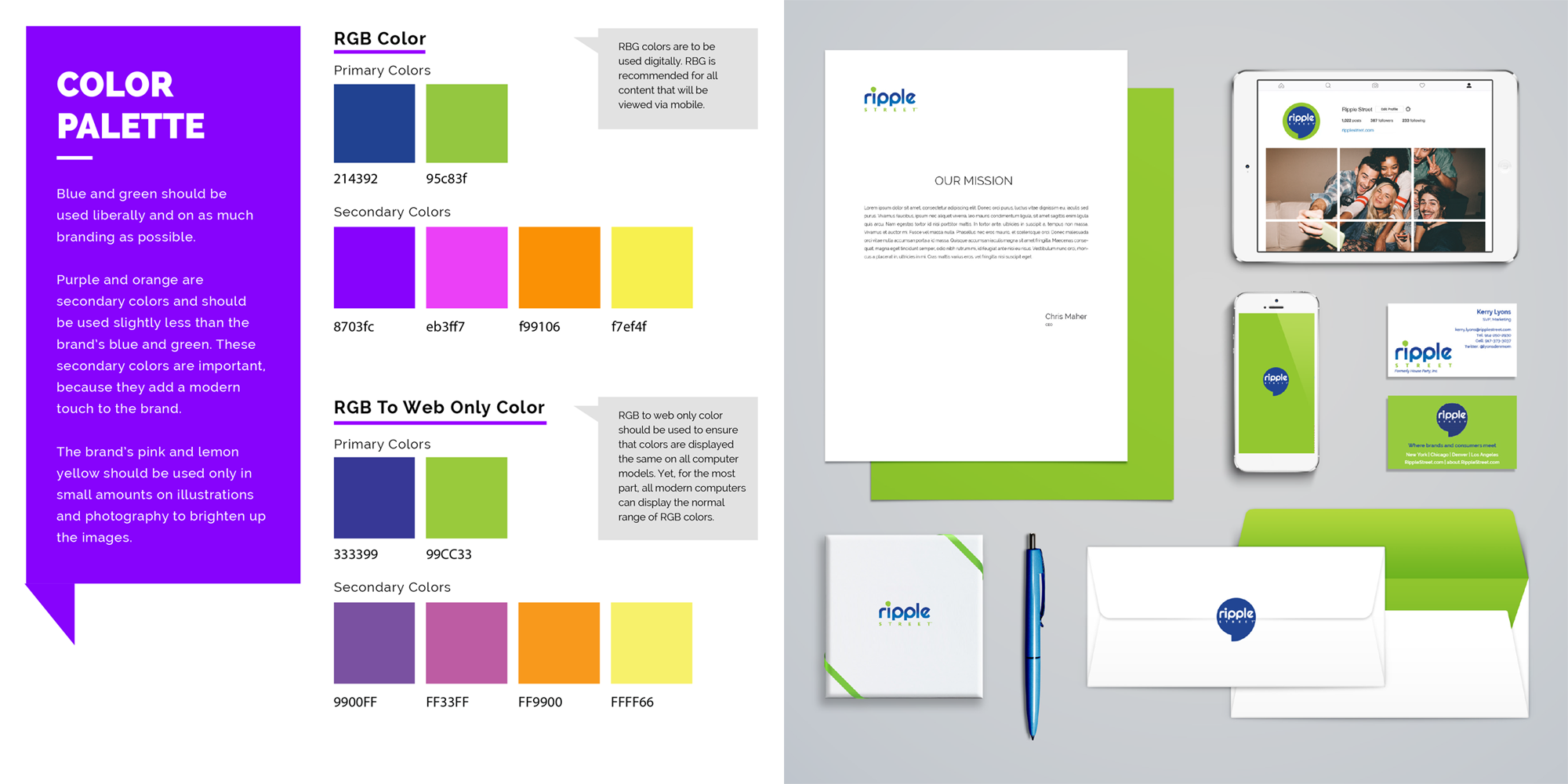
COLOR
The old palette felt cautious. I built something that didn't.
I drew inspiration from sunrise and sunset to create a bold, saturated, and alive palette. One that could hold its own across digital, print, and packaging without ever tipping into corporate.
Secondary palette
Primary palette

LOGO
The logo wasn't broken. But it wasn't right either.
The logo had history. People knew it. But the more I looked at it, the more problems I saw. The letterforms were unevenly spaced, the icon was literally just the full wordmark crammed into a circle, and none of it held up well at small sizes. I tightened the kerning, rebuilt the icon from scratch so it could actually work as a standalone mark, and added a small speech-bubble shape to the dot on the 'i' — a quiet nod to the conversations Ripple Street is built around. Same logo. Much better.
ILLUSTRATION
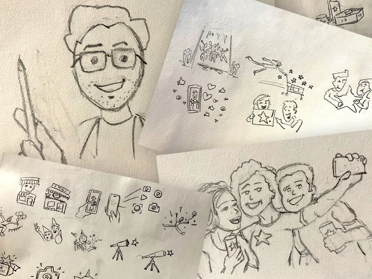
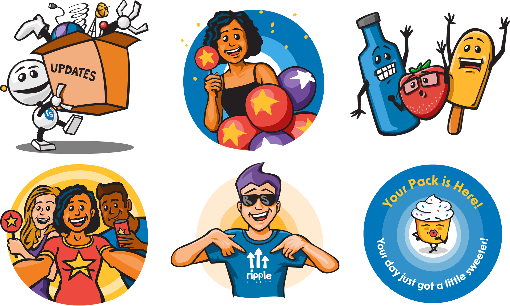
A drawing of myself changed the direction of the brand.
A few months in, I started adding illustrated characters to internal design updates, starting with a drawing of myself, just to make people smile. That popped the cork. Not because illustration became a cornerstone of the system, but because it broke something open. The loose, hand-made energy of those drawings made the geometric patterns I'd been exploring feel cold by comparison. I stopped trying to build something precise and started trying to build something warm. That's where the hand-drawn ripple rings came from, and they became the true signature of the brand.
SYSTEM
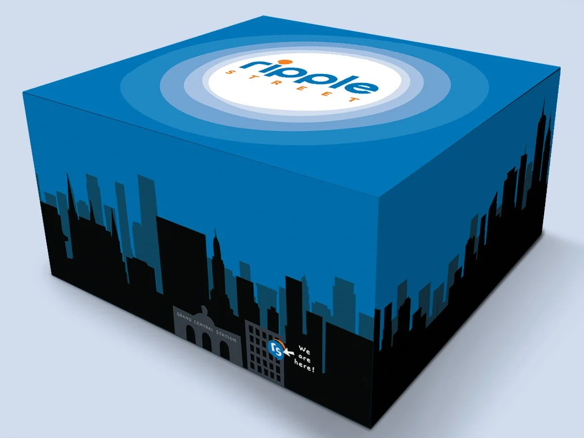
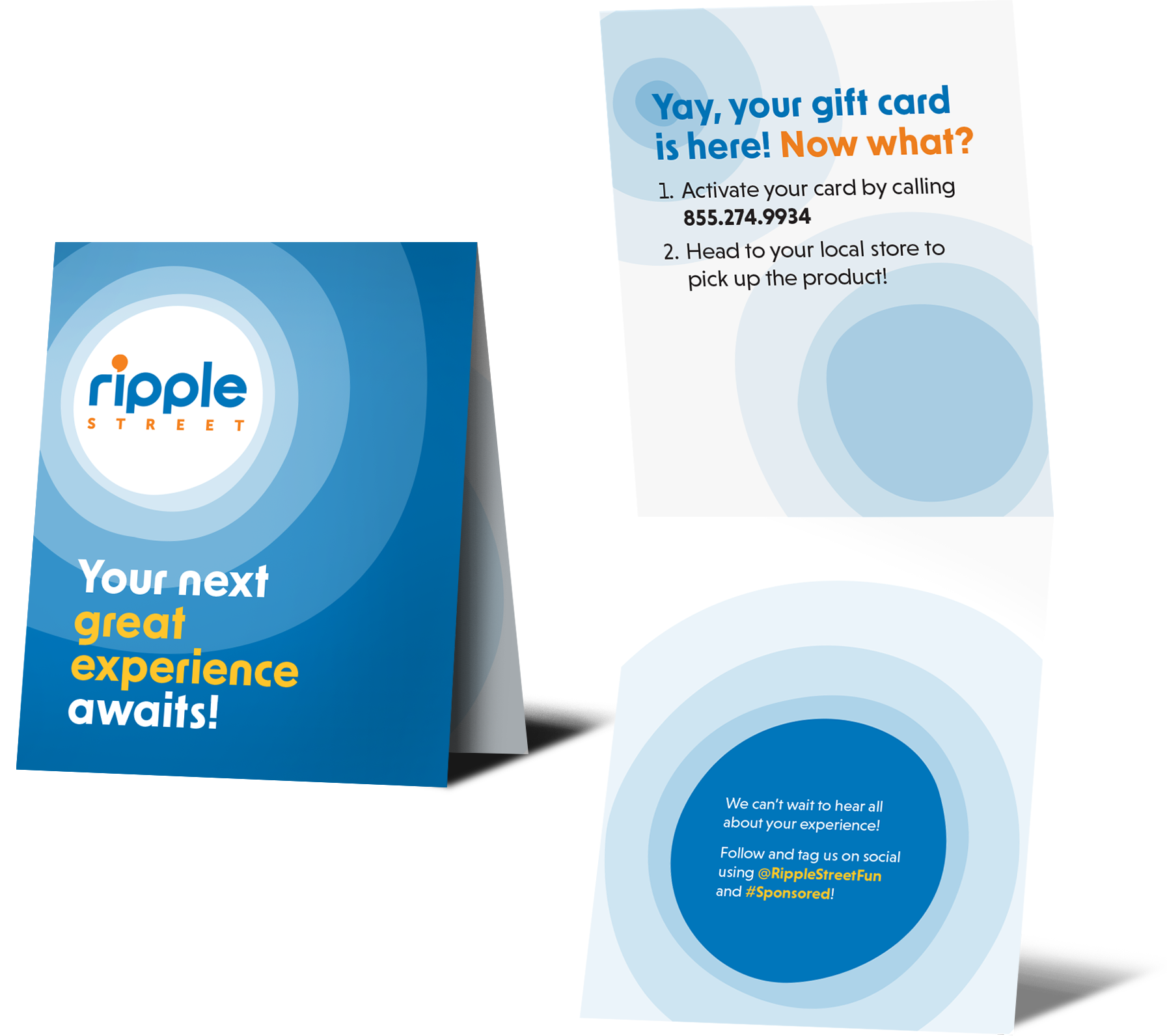
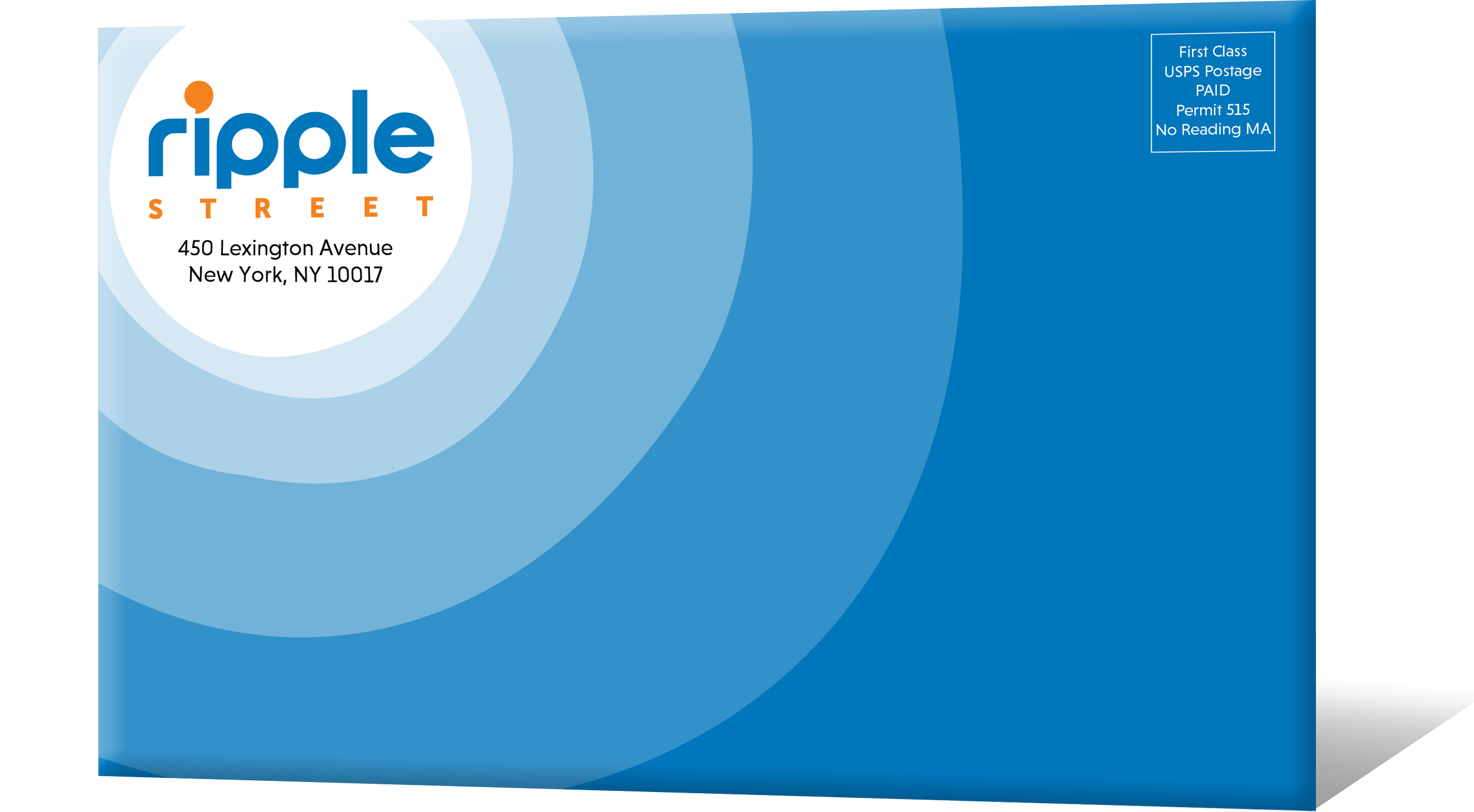
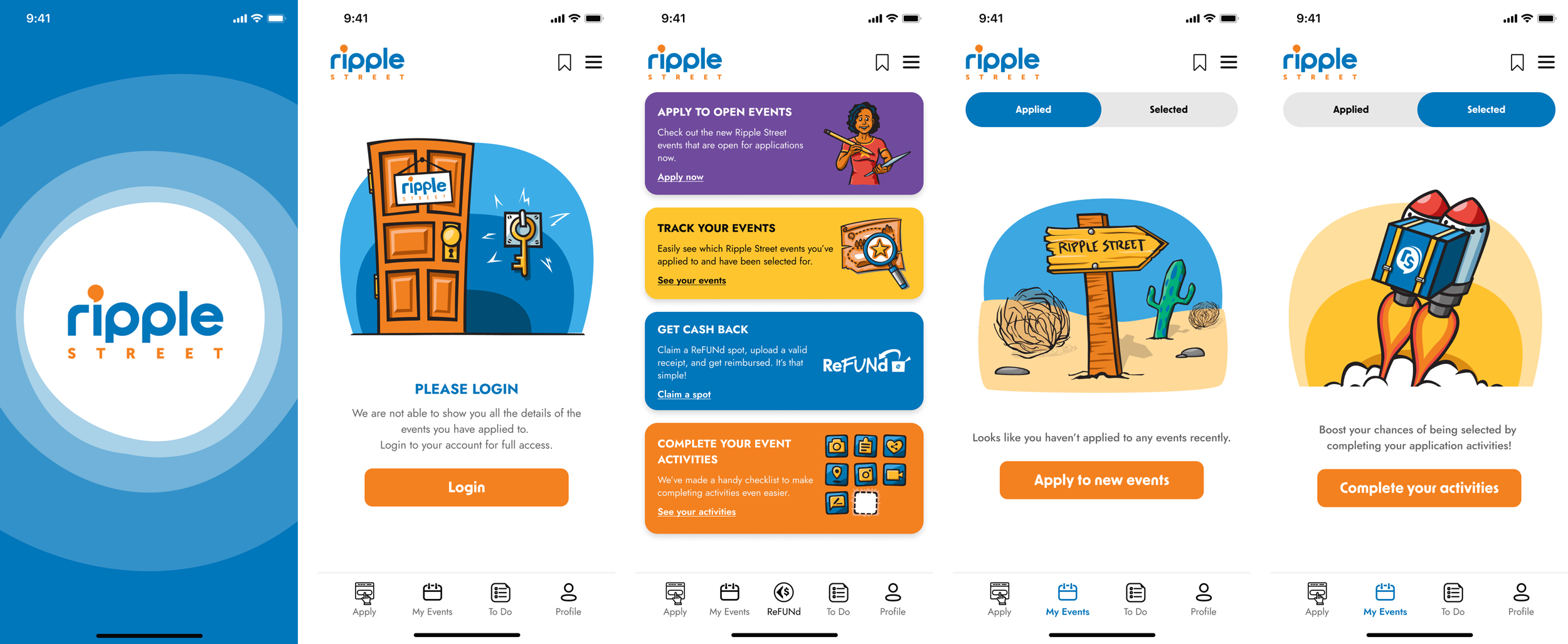
Built to scale across every surface.
Packaging, social, campaign banners, email, app UI, video. Every touchpoint ran through the same filter: does this look like us now? The visual language only got more distinctly Ripple Street from here.
RESULT
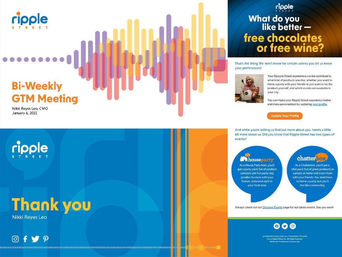
Boom! Now we had a brand that looked and felt like Ripple Street!
The first full reveal came at a company-wide Go To Market meeting, where the new system appeared integrated across live materials for the first time. The response was overwhelming. More importantly, it gave me the confidence to keep pushing. The templates from that day have evolved dramatically since, but the visual language has only gotten more distinctly Ripple Street.
The effects rippled (see what I did there?) outward. The sales team walked into client meetings with materials they were proud of. Our community manager noted that the quality of UGC on our Instagram began to improve as the brand identity sharpened — members were matching the energy we were putting out. Emails came in from community members saying the updated packaging made the experience feel more special.
MY ROLE
Sole in-house designer and creative director. I owned the full scope: brand audit, strategic direction, visual system design, and execution across every touchpoint. The system continues to evolve, and I continue to be the only person building it.
NEXT CASE STUDY
Team Tech Challenge
Designing for two brands at once — and knowing which rules to bend.
Also worth a look: Selected Work →