CASE STUDY
StoryCorps Annual Report
A loose brief is only a gift if you know what to do with it.
StoryCorps collects the stories of everyday Americans. The design had to feel like it belonged to those people — not to a designer.
StoryCorps' visual identity is intentionally fluid. It shifts to serve the story being told, which is true to their mission and genuinely difficult to design within. The Annual Report covered the full breadth of a year's work: programs, impact data, interviews, and stories from across the country. The challenge wasn't execution. It was finding the idea that would hold all of it together.
The answer was already in the content. It just needed to be drawn out.
THE ASSIGNMENT
A sprawling document. A fluid brief. Two weeks.
StoryCorps' in-house art director was exceptional and stretched thin. She needed a trusted extra hand on the Annual Report, which was a multi-section document covering programs, impact data, donor recognition, and stories from communities across the US. I was given access to their asset library, a curated photo collection, and one directive: make it feel like a cohesive whole. Some content was still being written while I was designing. Revision time was minimal. The freedom was real. So was the pressure.
THE CONCEPT
The connective tissue of the whole report was already there. I just had to name it.
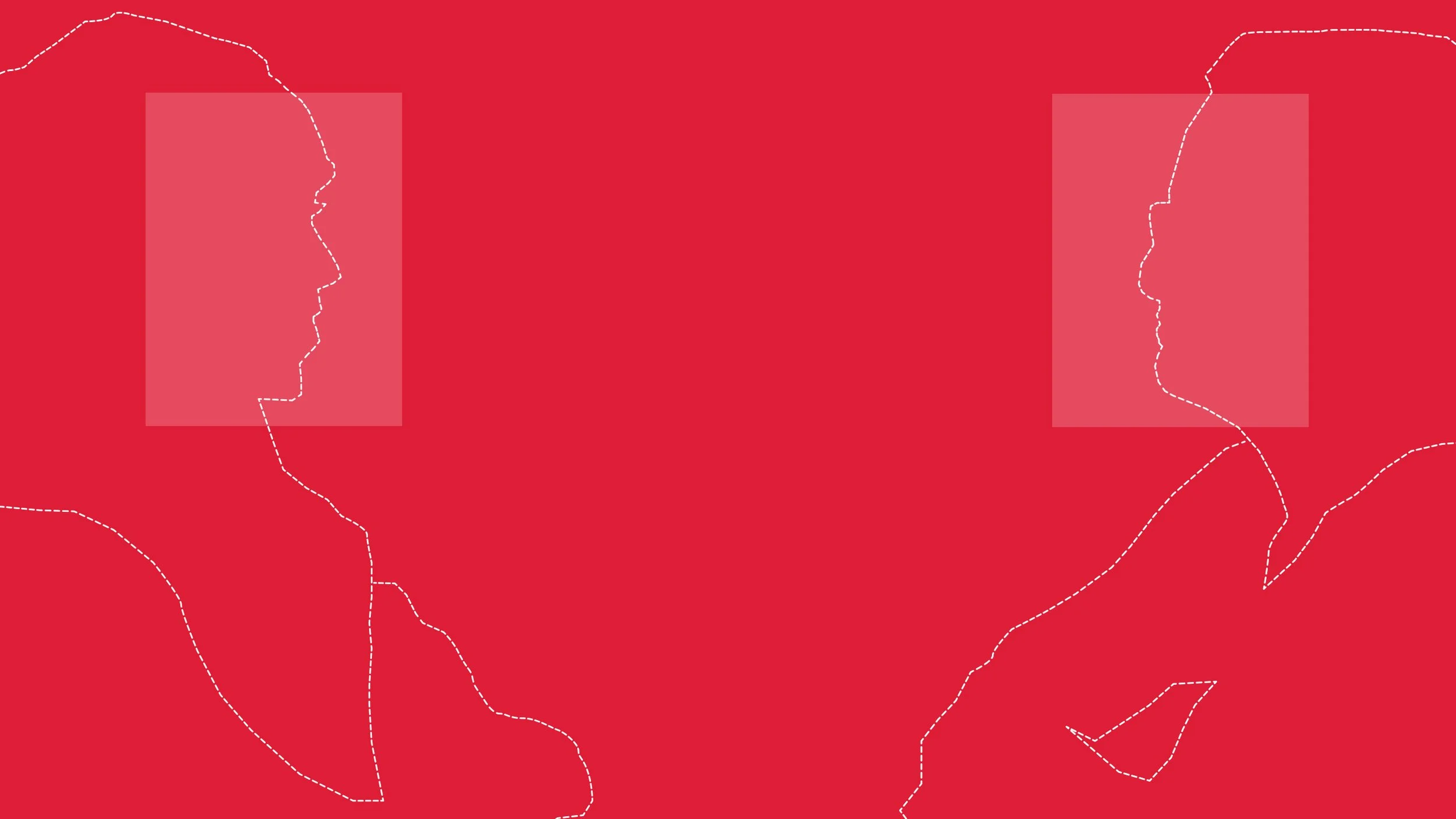
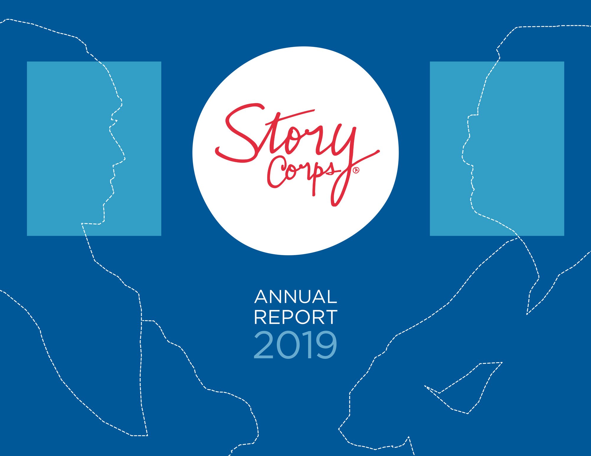
StoryCorps had spent the year collecting stories from across the country — people reaching each other across distance, difference, and political divides. That was the thread. I built a visual metaphor around it: a roadmap. I developed an illustration that mimicked a map and used that language throughout, including the cover, section openers, and the way elements connected across the page. The dashed lines running through the report aren't decoration. They trace the same movement the stories themselves describe.
THE HUMAN ELEMENT
There are moments in editorial design where a photograph creates distance instead of intimacy.
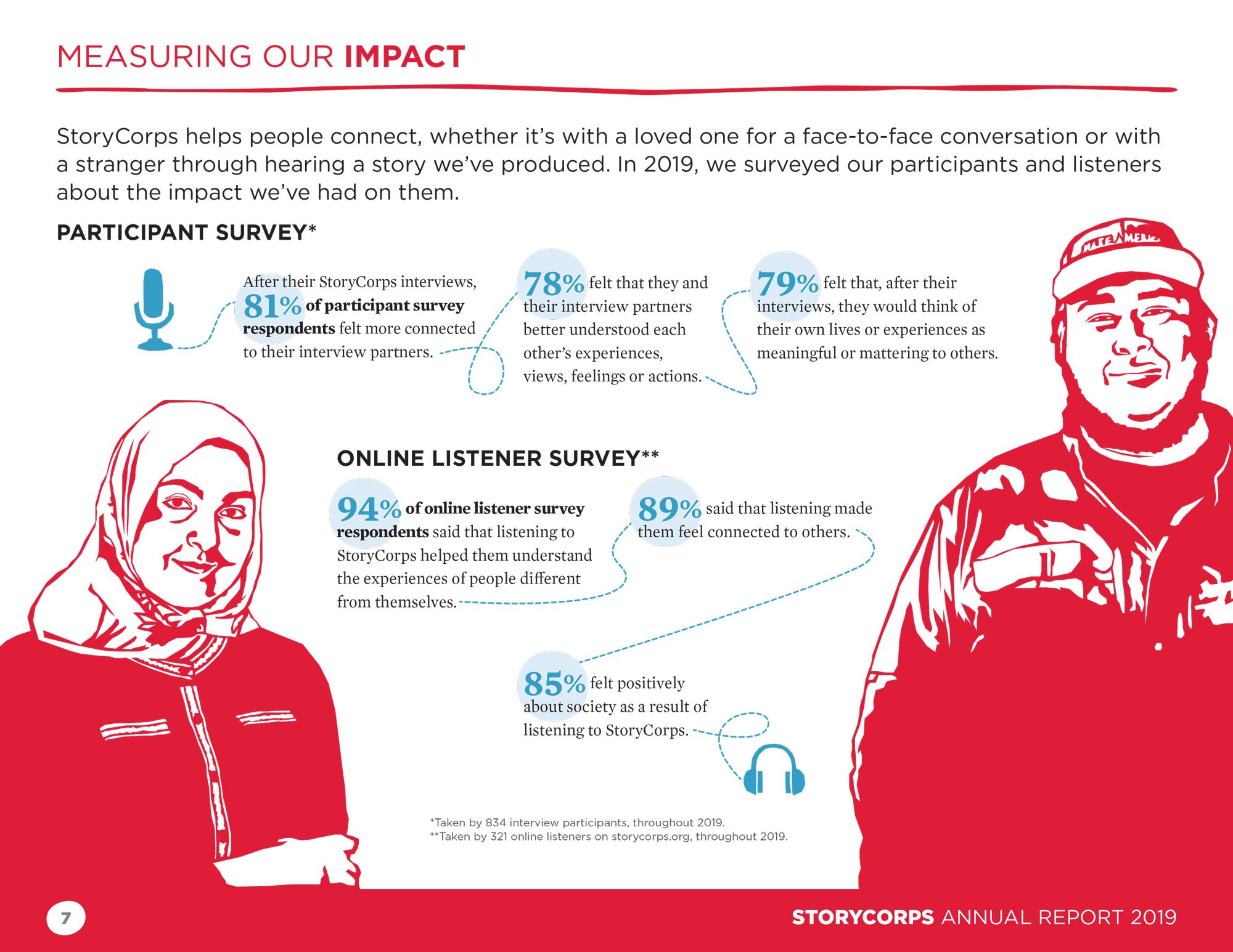
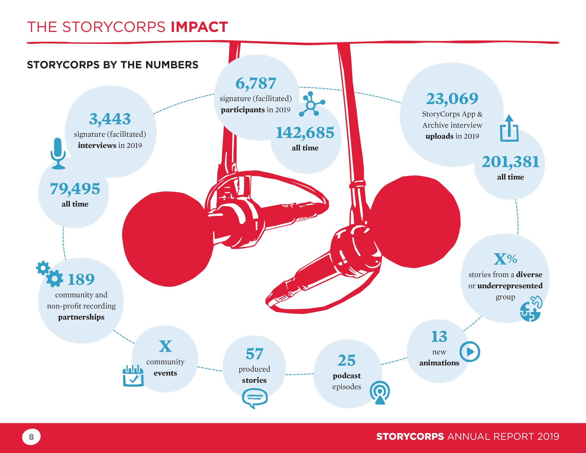
Several sections dealt with impact data where a photograph would have felt staged and cold. I placed hand-drawn two-color illustrations instead, based on figures from the StoryCorps photo archives, red and white, kept deliberately simple. They added a handcrafted warmth that felt right for an organization whose mission is human connection, and gave me a recurring visual element I could carry through the document without overusing.
THE DELIVERABLE NO ONE EXPECTED
She kept telling me not to worry about it. I kept telling her I'd let her know.
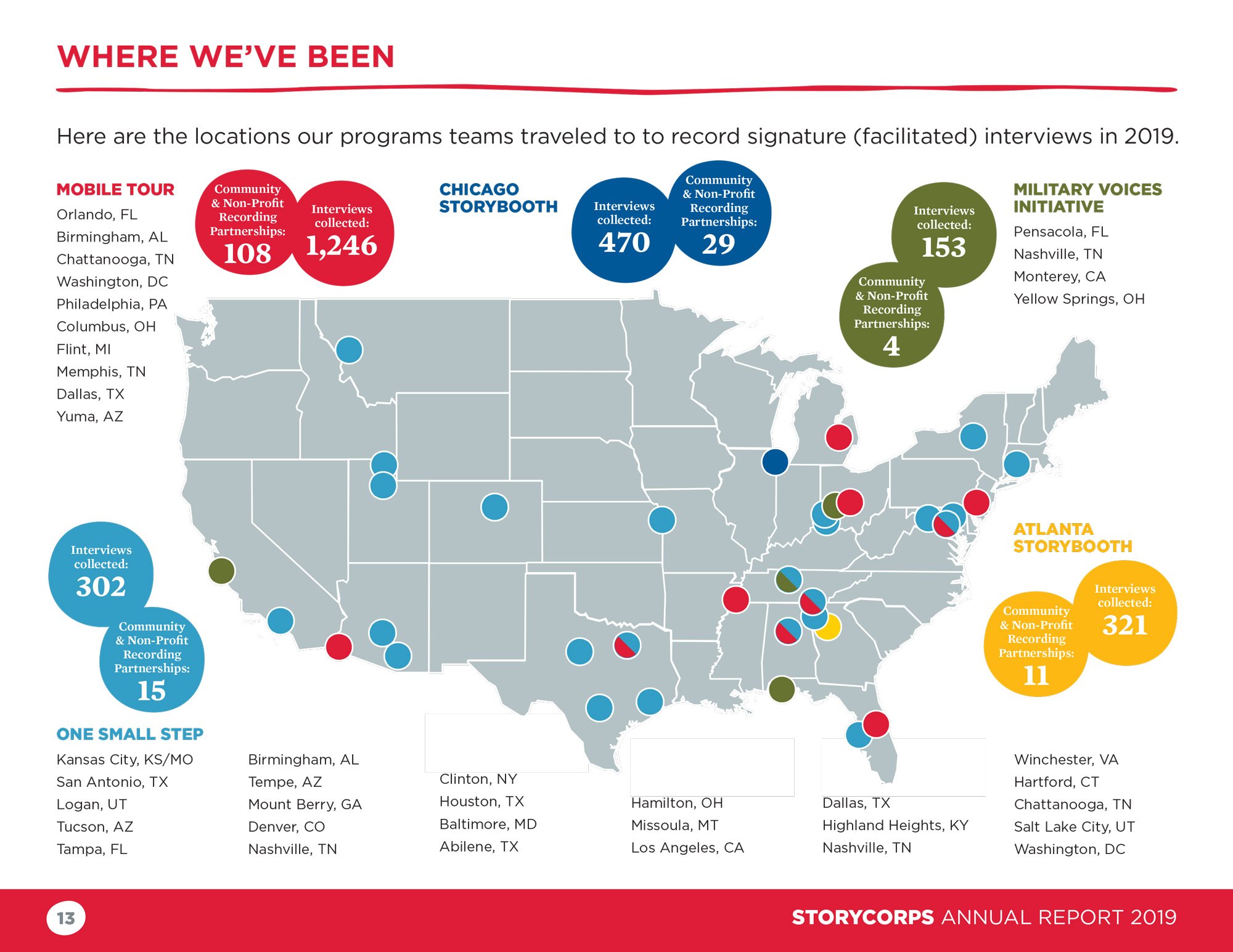
On the wish list was a custom map showing every Signature Interview location. Multiple initiatives, dozens of locations, stat callouts for each, all needing clear visual differentiation. She flagged it almost apologetically and kept walking it back. I kept quietly intending to hand her a finished map at the end. The complexity was real: pulling all the location data, building hierarchy across initiative types, making it feel designed rather than plotted. It came together, made it into the final document, and landed exactly the way I'd hoped.
OUTCOME
The report landed. The relationship didn't end there.
Work had been shared incrementally throughout the process, so by the end, StoryCorps already knew it was working. The report was considered a success. More telling: years later, StoryCorps still reaches out when they need an extra hand. That kind of repeat trust, from an organization with high standards and a strong visual identity, is the result I'm most proud of.
MY ROLE
Freelance Art Director. Concept, design, illustration, and layout across the full annual report.
PREVIOUS CASE STUDY
Team Tech Challenge
Designing for two brands at once — and knowing which rules to bend.
Also worth a look: Selected Work →